
Sunday, April 28, 2013
Color
Here is a poster for a Coaches vs. Cancer fundraiser I would some day like to hold in memory of a friend of mine. It was designed to be over a black background with white font, but here it is with out black or white.

Sunday, April 21, 2013
Color
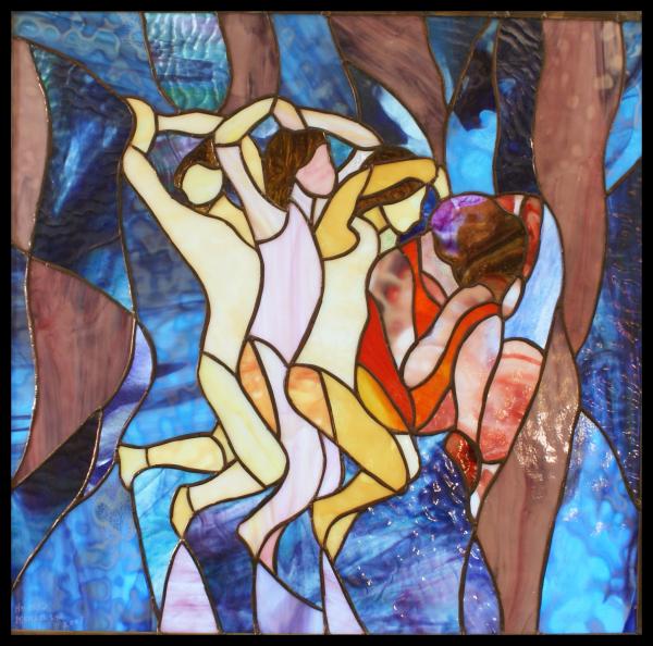
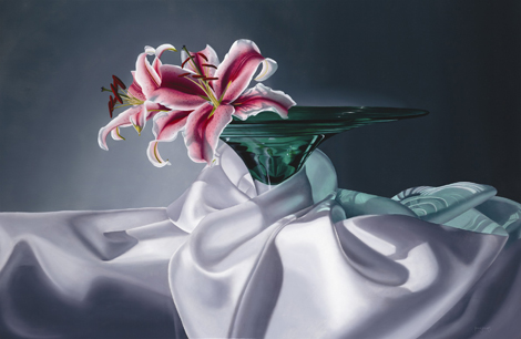
Here are my color wheels and scales. For my wheel, I found a blank template online that I really liked, and simply colored it myself. I like that there are three circles for the primary colors, squares for the secondary, and triangles for all the in between hues.

Below are the scales I did. I did a scale of 13, I believe, hues for blue into white, blue into red, and yellow into red.


Below are the scales I did. I did a scale of 13, I believe, hues for blue into white, blue into red, and yellow into red.


Sunday, April 14, 2013
Self Portrait
Here is my self portrait, using only the grayscale patterns and textures from a few weeks back. This picture was taken of me on vacation last year, but is one of my favorite photos. I used Photoshop to create layer masks for each of the patterns. This was a really fun project.


Sunday, April 7, 2013
Illusion of Space and Motion
We were tasked this week with finding 3 representations of illusion of space and 3 representations of 3 illusions of space, and were asked to illustrate how they represent their respective principle. For illusion of space, I chose the following principles:
Aerial Perspective
Multipoint perspective
Overlapping
Below are the pieces, with the explanations of their use edited onto the art itself.

Overlapping:
 The three principles of motion that I chose are:
blurred lines
anticipated motion
repeated figure
Here are the pieces I chose:

Anticipated motion:


Aerial Perspective
Multipoint perspective
Overlapping
Below are the pieces, with the explanations of their use edited onto the art itself.
Aerial Perspective:

Multipoint Perspective

Overlapping:

blurred lines
anticipated motion
repeated figure
Here are the pieces I chose:
Blurred Lines:

Anticipated motion:
Repeated Figure

Sunday, March 31, 2013
Pattern and Texture
The piece below is a grayscale representation of 15 different patterns and textures from around the house and yard. I believe, after having completed this, that the assignment only needed 11, but I didn't feel the need to re-do the assignment as I believe it illustrates the same principles.


Sunday, March 24, 2013
Shape/Volume
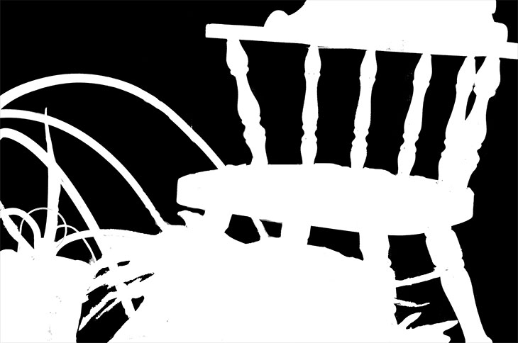
This week we were asked to create three negative space works. For my still life elements, I chose a big potted plant and a wooden sitting chair. I took them at different zooms and cropped them all at different angles. The original photo's are below them. Keep in mind, they were cropped and angled.
Piece 1:


Piece 2:


Piece 3:


Piece 1:

Piece 2:


Piece 3:


Sunday, March 17, 2013
Line
Here are my line designs. The first are lines expressing the emotion presented. The second piece are verbs being expressed by lines. The last two are dry and wet media types of a mug.


Balance v2
Below is the second variation, and the correct one I might add, of my balance assignment. The first version is the positive space, the second is the negative space version. Please note that my forks didn't stay down after glue and cause a little shadow.


Sunday, March 3, 2013
Rhythm
 |
| Top of the Falls, by Eric Green |
 |
| cropped image |
Next, I cropped the image down just to focus on the water going over the ledge that creates the sensation of sound. There is also a lot of movement and rhythm within this part of the photo.
 |
| Loud |
 |
| Gentle |


Splatter and Rushing
After this, I created several other versions that I will post later. I also drew up the following rhythmic piece using alternating rhythmand then added noise and various other filters to help it more resemble the sense of sound.

Sunday, February 24, 2013
Positive and Negative Space examples
Please note that because of glares from the actual photos, it was not that easy to cut out the precise sillhouette in Photoshop, which is why these individual pieces might look somewhat grainy. However, I actually like the effect it gave so I didn't actually mind. Below are the two examples. The first is the examples of the objects in positive space. I have tried to illustrate overlap in four areas, the wine bottle to the wine glass, the tea pot to the tea cup, the fork to the plate, and the spoon to the knife. These were difficult to display in a 3D element. I feel I could have done a better job by tracing the outside of the dominant object in these instances with either white or black respectively to further illustrate the overlap, but wasn't sure if that was acceptable for the assignment. The second is the same piece, only showing the negative space.


Below is the second part, where I took the negative space and displayed it differently and added some text. I guess I envisioned this being on a menu or as an advertisement in traditional media.

Sunday, February 17, 2013
Collage

Sunday, February 10, 2013
Absence of Focal Point
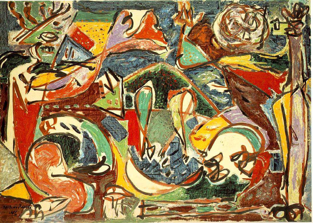
I've been waiting to use Jackson Pollack as an example and this seems like as good an opportunity as any. This piece, titled "The Key" is an example of a piece of art with no real focal point. While there is something that absolutely captures me with this piece, I am having a difficult time understanding what it is and why it is able to do this since my eye isn't quite sure where to land when looking at it. I find myself looking for something to capture my eye, and when not one single element does I am not sure how to feel.
Image courtesy of: http://www.ibiblio.org/wm/paint/auth/pollock/pollock.key.jpg

Image courtesy of: http://www.ibiblio.org/wm/paint/auth/pollock/pollock.key.jpg

One Element

Placement
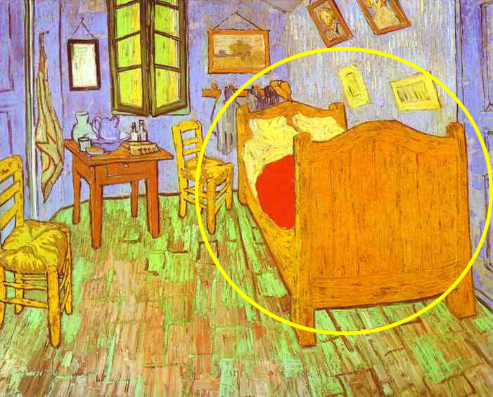
Image courtesy of: http://www.famous-paintings.org/Vincent-van-Gogh/90.jpg
Isolation

Original image courtesy of: http://rosemarywashington.files.wordpress.com/2011/05/van-gogh-a-pair-of-shoes.jpg
Contrast

Original image courtesy of: http://www.arizonafoothillsmagazine.com/images/stories/march10/jane-jones.jpg
Sunday, February 3, 2013
non-objective unity

Hard to follow

Repetition

One criticism I have is that there are several spots of the canvas that are blank, and they appear to have no deeper significance. I think these spots could have been utilized rather then simply being blank, as it does sort of deter from the overall continuity of the piece.
Proximity

Saturday, February 2, 2013
Grid, repetition, and continuation

The grid is clearly used to organize the piece with the position of each person. I feel like each section of the grid is composed of both the person telling the secret and the person being told--it provides a symmetry and continuity by doing it this way.
It also demonstrates a successful use of repetition. Despite that each face is unique, the pattern repeats and creates a rythym. Therefore, to me it demonstrates both types of reptition. The pattern repeats in a similar, organized matter and the variety of faces show a repetition of variety.
Rockwell also uses proximity well in this piece. Not only does putting the faces close together add a dramatic flare, but if there was too much space between each face, it would simply be a collection of faces and there would be no real relationship to each other.
Having not looked at this piece in probably a decade, I must say how neat it is that he ends each row with one person who has just received the secret and starts the next row with said person telling another. An artistic cliff hanger, I suppose, until it comes full circle at the end. A great use of the grid to tell the story.
Sunday, January 27, 2013
2D Art example

Welcome!
Welcome to my blog! The purpose of this blog is to serve as a portfolio for an art class I'm currently taking. Check back often to see the turns it takes throughout the semester!
Subscribe to:
Comments (Atom)