Sunday, March 17, 2013
Balance v2
Below is the second variation, and the correct one I might add, of my balance assignment. The first version is the positive space, the second is the negative space version. Please note that my forks didn't stay down after glue and cause a little shadow.
Sunday, March 3, 2013
Rhythm
![]() |
| Top of the Falls, by Eric Green |
![]() |
| cropped image |
Next, I cropped the image down just to focus on the water going over the ledge that creates the sensation of sound. There is also a lot of movement and rhythm within this part of the photo.
![]() |
| Loud |
![]() |
| Gentle |
Splatter and Rushing
After this, I created several other versions that I will post later. I also drew up the following rhythmic piece using alternating rhythmand then added noise and various other filters to help it more resemble the sense of sound.
Sunday, February 24, 2013
Positive and Negative Space examples
Please note that because of glares from the actual photos, it was not that easy to cut out the precise sillhouette in Photoshop, which is why these individual pieces might look somewhat grainy. However, I actually like the effect it gave so I didn't actually mind. Below are the two examples. The first is the examples of the objects in positive space. I have tried to illustrate overlap in four areas, the wine bottle to the wine glass, the tea pot to the tea cup, the fork to the plate, and the spoon to the knife. These were difficult to display in a 3D element. I feel I could have done a better job by tracing the outside of the dominant object in these instances with either white or black respectively to further illustrate the overlap, but wasn't sure if that was acceptable for the assignment. The second is the same piece, only showing the negative space.
Below is the second part, where I took the negative space and displayed it differently and added some text. I guess I envisioned this being on a menu or as an advertisement in traditional media.
Sunday, February 17, 2013
Collage
I know, I'm a romantic. This collage is a gift I made for my fiance for Valentines Day. I knew this was our project for the same week, so I decided to kill two birds with one stone. Further, most of the pictures I had on my computer were of us together anyways!! I tried to vary the size of the photos so as to enlarge some of the photos that I really like and are important to me. The smaller photos are intended to build a heart-shaped frame for the black and white image, which I think is the focal point. That message is meant to show the importance both my fiance and I see in love, not only for each other but for our families, friends, and careers. Let me know if I did my job lending importance to some photos over others, or if I failed. Thanks!
Sunday, February 10, 2013
Absence of Focal Point
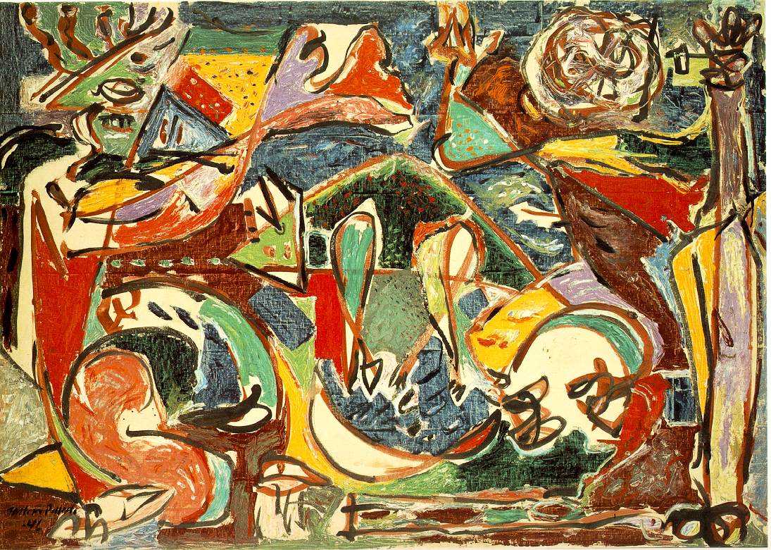
I've been waiting to use Jackson Pollack as an example and this seems like as good an opportunity as any. This piece, titled "The Key" is an example of a piece of art with no real focal point. While there is something that absolutely captures me with this piece, I am having a difficult time understanding what it is and why it is able to do this since my eye isn't quite sure where to land when looking at it. I find myself looking for something to capture my eye, and when not one single element does I am not sure how to feel.
Image courtesy of: http://www.ibiblio.org/wm/paint/auth/pollock/pollock.key.jpg
One Element
I first saw this piece on as a poster on the wall of a friend of mine that was studying architechture. This M.C. Escher piece has one element as the focal piece: the glass ball in the hand. However, what is cool about this piece, is that element is a mirror and shows the reflection of what is behind the hand holding it. It's really neat in my opinion, that it uses the focal point as the vehicle to show what is going on behind the hand. I have circled in white the focus point.
Placement
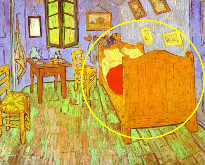
As a lover of Van Gogh, here is another piece of his to illustrate focal point. This piece, I believe titled "Bedroom", has a focal point on the right side of the canvas. To me, the focus point is the bed, which is disproportionately large in comparison to the other elements in the work. It is a different color wood than the chairs and the desk in the piece, and it spans nearly half of it's width, meaning to me it has more significance than the other elements.
Image courtesy of: http://www.famous-paintings.org/Vincent-van-Gogh/90.jpg
Subscribe to:
Posts (Atom)